
How Interior Design Taps Into Emotion, Energy, and Style
Contenido
Color is far more than a decorative decision—it’s a tool that shapes how we feel, think, and experience space. When used with intention, it can elevate a room from functional to unforgettable. Whether you’re remodeling a cozy bathroom retreat or curating a bold kitchen statement, understanding the psychology of color gives you the power to design with purpose.
Here’s how to make color work for your home:
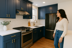
🔹 1. Blue: Tranquility and Trust
Associated with calm, clarity, and concentration, blue tones are ideal for spaces where serenity is key—like bathrooms, bedrooms, and home offices. Opt for soft, cool hues like misty blue or powdery sky tones to encourage relaxation. For a bold, dramatic impact, navy and deep cobalt work beautifully as accents on cabinetry or tile walls.
🔹 2. Red: Energy and Passion
Few colors command attention like red. It stimulates conversation, appetite, and even heart rate—making it a go-to in social areas like dining rooms or kitchen islands. Deep wine tones add elegance and depth, while brighter shades like tomato or coral can energize a breakfast nook. Use red strategically to avoid visual overwhelm.
🔹 3. Yellow: Optimism and Warmth
From pale butter to bold sunflower, yellow radiates positivity. It’s particularly effective in kitchens, laundry rooms, and small entryways, where it can bounce light and expand visual space. Consider a muted mustard backsplash or golden-toned lighting to create a cheerful, sun-drenched feeling—even on cloudy days.
🔹 4. Green: Balance and Freshness
Symbolizing renewal and connection to nature, green is one of the most versatile hues. Sage and olive are calming and sophisticated for bathrooms, while mint or emerald inject life into kitchens and living spaces. Pair it with natural textures like wood or stone for a biophilic effect that’s both grounding and energizing.
🔹 5. Neutrals: Timeless and Flexible
Whites, grays, and taupes offer a clean canvas that adapts to any design style—from minimalistic to maximalist. Warm greige tones can add softness without sterility, while cooler grays work well with modern, industrial aesthetics. Neutrals are also ideal for layering textures and playing with lighting—especially in small or transitional spaces.
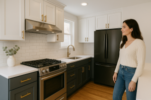
🔹 6. Black and Charcoal: Drama and Sophistication
Used thoughtfully, black brings luxury, intimacy, and high contrast. Matte black fixtures or charcoal cabinetry can anchor a space and create striking silhouettes, particularly when balanced with natural light or reflective surfaces. In bathrooms or kitchens, black offers an edge that feels intentional, not overpowering.
🎨 Pro tip for remodeling with color:
Consider how natural and artificial light affect your chosen palette. A soft beige might look cream under daylight but appear gray in LED. We always recommend testing swatches under real conditions before making final decisions—our design team can help you narrow down your options with professional insight.
Whether you’re drawn to bold color statements or subtle tones that whisper sophistication, the right palette transforms your space—and your mood. At Master Remodeling, we bring color psychology and design expertise together to craft interiors that feel as good as they look.
Etiquetas :
Compartir :
Artículos Recientes

Common Remodeling Mistakes (and How to Avoid Them Like a Pro)
🛠️ Mixing Metals in the Kitchen: A Guide to Modern, Functional Design
Steal-Worthy Kitchen Transformations: Inspiration from Real Renovations